About the Contributor
Shea Stuckey, Journalist
Grade: Senior
Hobbies: Theatre, reading, listening to music, watching movies
Favorite drink: White hot chocolate with peppermint
Best restaurant:...
December 21, 2022
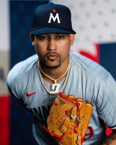
The Minnesota Twins unveiled a brand-new logo and new uniforms in early November.
The Twins revealed four new uniforms: one for home, one for away, and two for alternate looks. Minnesota Twins executive vice president Joe Pohlad responded to ESPN to say that the new uniforms are representative of the evolution the Twins have gone through as an organization.
The redesign is an attempt to engage the younger generation of baseball fans. The new uniforms were designed specifically so that the lettering of “Twins” was legible on the field and on online media. The lettering lost its drop shadow and multicolored look in favor of a solid, bold red intended to look better on camera. Fear not loyal Twins fans, the “win” in “Twins” remains underlined, continuing the long-standing tradition that’s been around since 1987 when the Twins won the World Series.
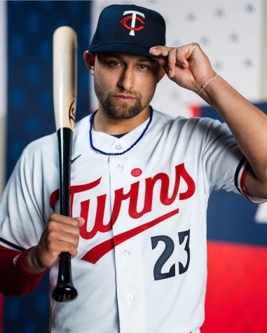
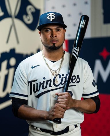
The new alternate uniform is a pleasant cream color and has “Twin Cities” written in bold navy blue lettering and is complimented with an all-navy blue hat.
Tyler Hemmesch likes the new uniforms but still misses the old ones. “I think they’re new, and they look good. But I’m upset they got rid of the old jerseys” he explained.
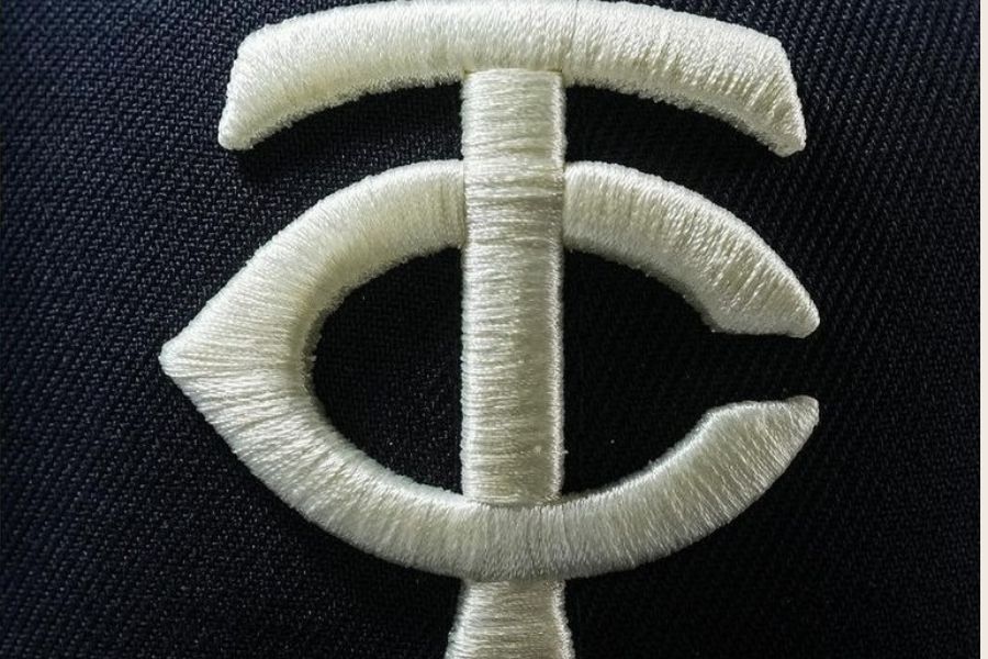
The Twins also introduced a brand new hat design to go along with the uniform redesign. The new hat showcase a bright white “M” and a red star meant to represent the North Star. The star is a nod to both Minnesota’s nickname “the North Star State” and the four other Minnesota sports teams that feature this emblem. The “M” was retained from the classic Twins hats with a new twist.
In a quote to ESPN Pohland said, “We didn’t want to screw up a good thing.We wanted to make the next thing.” He explained that the old “M” had a lot of affection and became an important part of the new design.
Local twins fans are split on their opinions of the new hat.
Ava Tavale likes the new hat saying “I like it, it reminds me of the Houston one but I like it, it’s very simple and minimalistic.”
Greta Foss is against the new hat design. “If you showed me that I wouldn’t think, ‘Oh! Twins!’ So I don’t really think it’s doing its job,” Foss explained.
The new uniforms usher in a new era for the Twins, an era that many fans (young and old) hope will bring forth a World Series win for the team.
Grade: Senior
Hobbies: Theatre, reading, listening to music, watching movies
Favorite drink: White hot chocolate with peppermint
Best restaurant:...