

Sartell’s Spotify Wrapped
Sartell students are evidently avid Spotify listeners, representing all types of genres in this years’ Spotify data.
Every year since 2016, the music streaming service Spotify compiles every users data into an annual summary. Each of these summaries are personalized to the user and the year. This years’ presentation was categorized by bright, neon colors and jewel tones, presented in a format that mimics the story feature on Instagram and Snapchat.
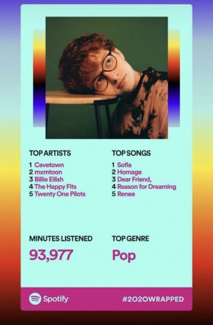
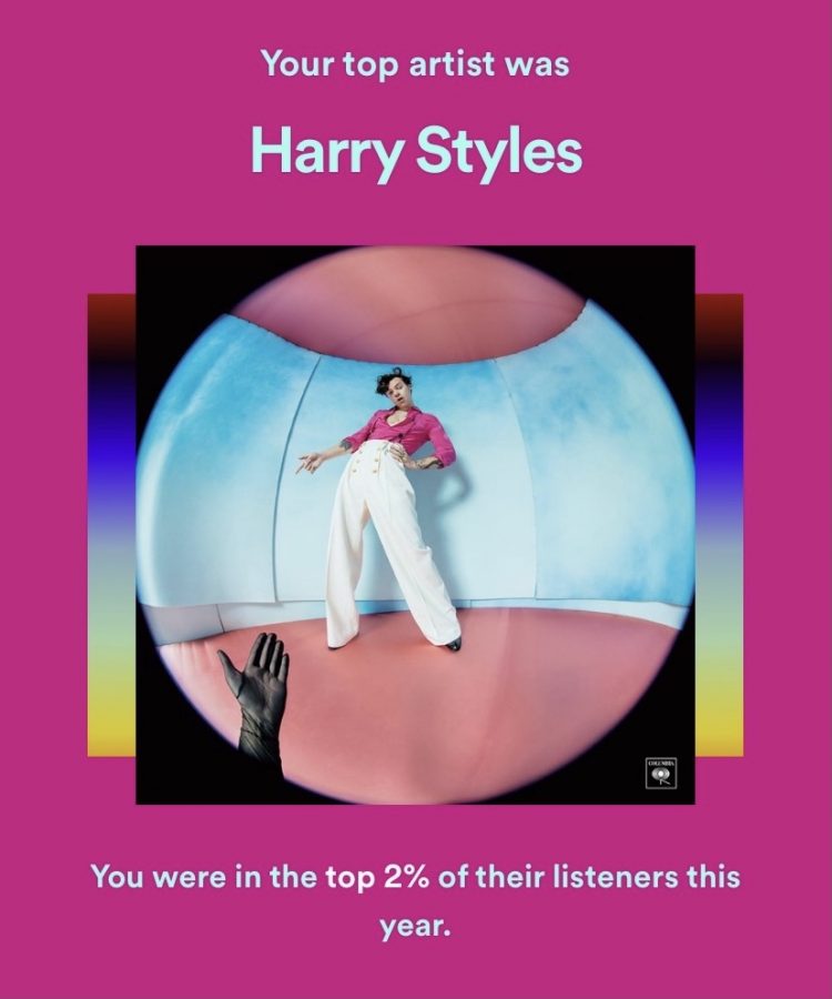
The data featured in the presentation includes your top artist, podcast, song, genre, and other categories and features. New features this year included a tally of how many minutes you listened to your top artist, and even how many times you stream your top song.
The ultimate wrapped feature for many seem to be the

cumulative listening minutes, which tells a user how many minutes they’ve spent listening to music in the last year.
Possibly everyone’s favorite is the feature that tells you what percentage of listeners you reached with your favorite artist.
Is Sartell’s taste in music superior? Scroll through our wrapped’s to find out:
For more Spotify wrapped content, look up the sponsored hashtag: #2020Wrapped on Twitter or Instagram.

Grace Radeke ('21) is new to writing for the LeSabre this year as a senior. She enjoys writing about politics and human interest topics. In her spare time...